2020 / Motion Design - 2'24" - 4K Video - 2020
İzmir Typeface Promo
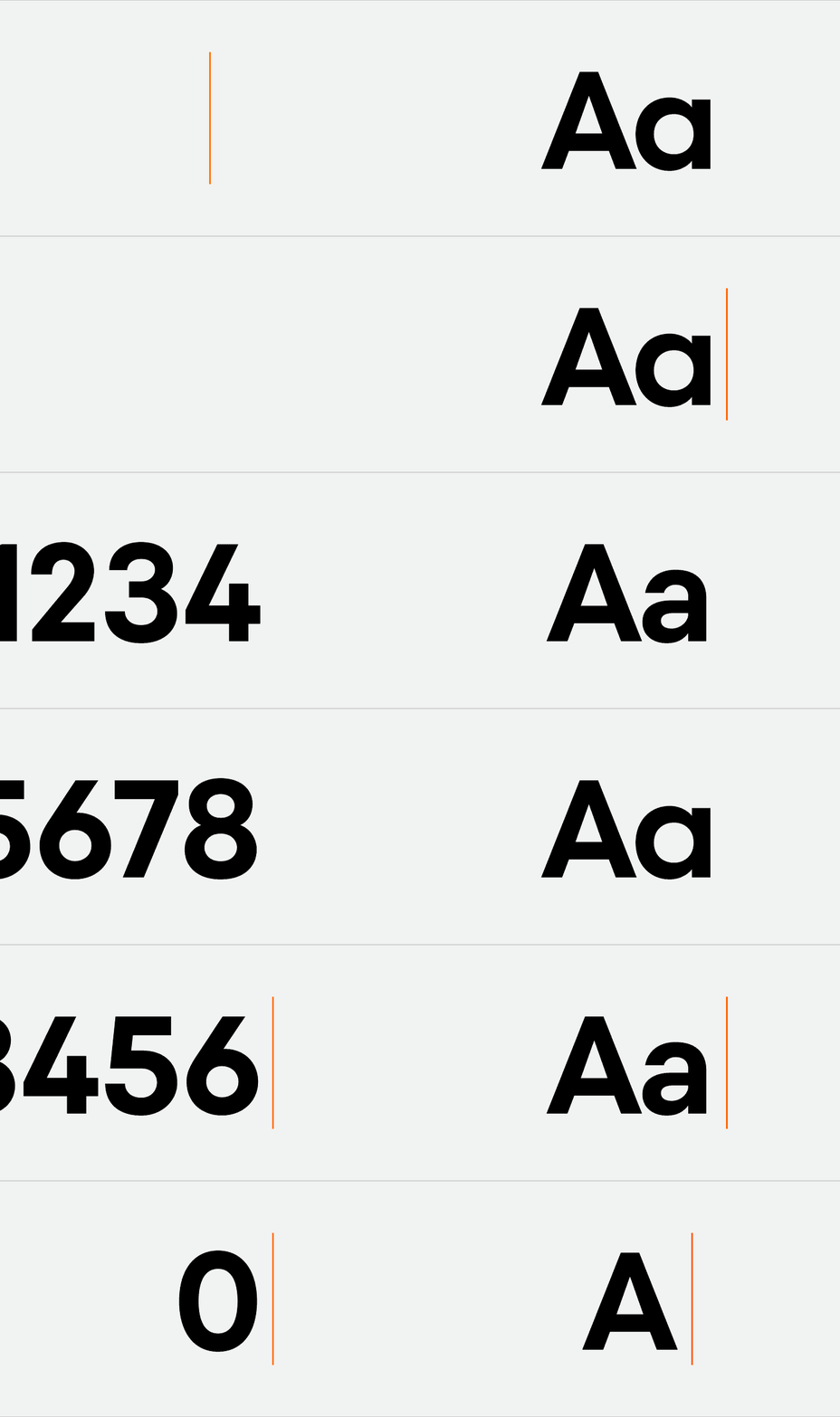
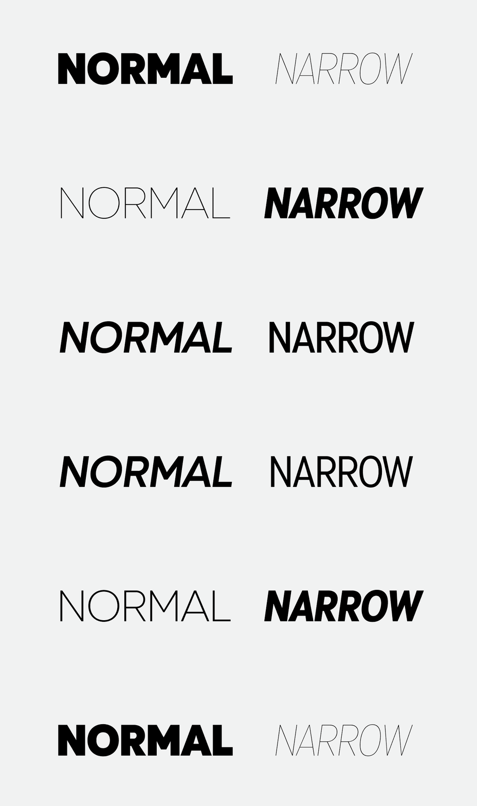
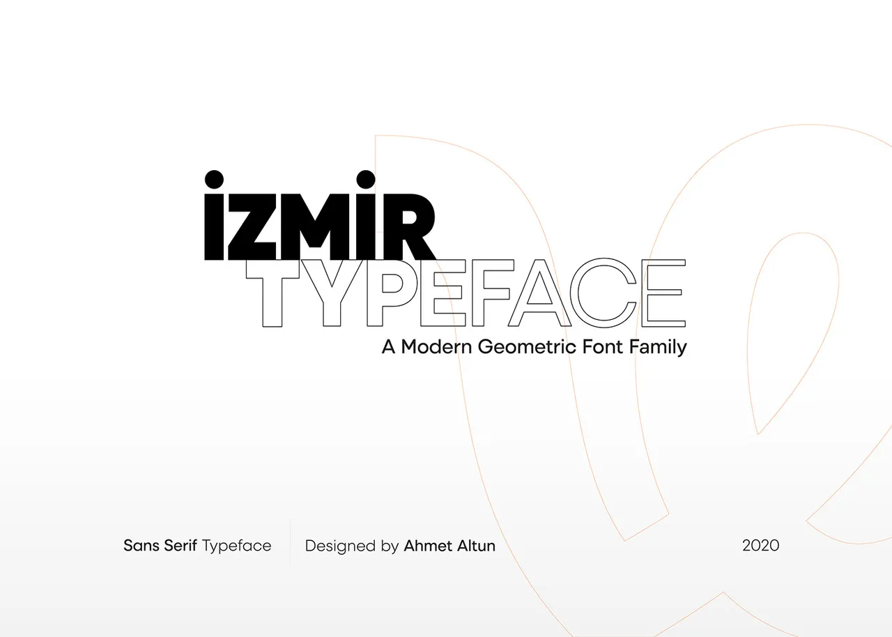
The İzmir Font Family is a geometric sans in normal and narrow widths, eleven weights, italics. It is a civic type system commissioned by İzmir Vakfı. The promo film had to introduce that entire structure in under three minutes: widths, weights, usage, and the relationship between typography and the city's visual identity.
My role sat across the wider identity and motion process. Alongside the animation, I was involved in industrial design work and designed much of the icon set, so the film had to extend a language I already knew from the inside rather than decorate it from the outside. The animation wasn't starting from zero. It had to preserve a calm, municipal tone while making the font's new ideas visible.
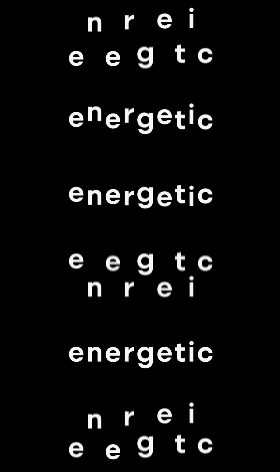
That tension shaped the edit. İzmir's identity reads quietly confident; a specimen film can easily turn into noise when every feature demands screen time. Rhythm became the main tool: contrast between width and weight, pacing that let each characteristic register before the next one arrived.
The result is a short film that reads as both type specimen and city portrait: enough structure for designers, enough atmosphere for a public audience, compressed into a tight production schedule.
The İzmir Font Family is a geometric sans serif designed in normal and narrow widths, with 11 weights and italic styles. For the promo film, the motion needed to show the type system clearly while keeping the energy of the city identity. My role was animating the specimens and building a rhythm around width, weight, and typographic contrast.
Credits
Graphic Design: Miraç Güldoğan
Motion Graphics: Çağatay Güçlü